 Campaign Sprint
 Naughty Nectar
Your ads aren't broken.
Your brand is.
Your brand is.

- 138 Views
Every week, somewhere on the internet, a business owner posts the same question in a slightly different way: "I've spent money on Meta ads. My targeting is solid. My copy is fine. Why are the results terrible?" The replies flood in — about campaign objectives, about audiences, about pixel issues and attribution windows. The one thing nobody says out loud is what's usually staring them in the face: the ad itself looks like it was made in twenty minutes. Because it was.
This isn't a targeting problem. It isn't a budget problem. It's a creative problem — and more specifically, it's a brand problem disguised as a creative problem. And the difference between those two diagnoses matters enormously, because they have completely different solutions.
The algorithm changed. Most brands haven't.
Since 2023, Meta's own data and third-party media buyers have confirmed the same shift: creative signal strength is now the primary variable in ad distribution. Not audience targeting. Not bid strategy. The ad itself — does it deserve to be seen?
The creative quality blindspot everyone ignores
The marketing industry spent years selling business owners a fundamentally comforting story: that performance advertising is a science problem. Pick the right audience, set the right objective, map the funnel correctly — and the money follows. That framing is appealing because it makes the whole thing feel controllable, and because it gives agencies and platforms something concrete to charge for.
The uncomfortable shift is this: by 2025, the platforms themselves had largely automated the parts that used to require expertise — audience segmentation, bid optimisation, placement decisions. What remained outside that automation was the one thing no algorithm can generate for you: an ad worth watching. Research from MarTech in early 2025 named weak creative as the single biggest reason paid social ads fail, ahead of targeting, budgets, and platform choice. Gen Z — the demographic every brand is desperately chasing — loses focus on ads in 1.3 seconds. There is no targeting precision sharp enough to overcome a creative that fails in the first second and a half.
What the algorithm rewards
- Ads that hold attention past 3 seconds
- Visually distinct, brand-consistent creative
- Motion that communicates before audio starts
- A coherent world the viewer recognises instantly
What gets buried in the feed
- Template-based Canva graphics
- Ads that look like ads from 2019
- Creative disconnected from the brand's identity
- Static images competing against motion content

The template trap
The market's predictable response to expensive creative has been templates. Canva made it possible for anyone to produce something that technically resembles an ad. Entire businesses exist to sell packs with names like "50 high-converting Meta templates" and "scroll-stopping Canva layouts." There is a thriving industry built around making ad creative faster and cheaper.
The problem operates at two levels. The first is commoditisation — when every brand in your category is running ads built from the same template architecture, those ads become invisible to the audiences who've already processed thousands of them. The platforms know this too. Higher CPMs for generic creative are now an observable, documented pattern — the algorithm flags ad-like content and charges more to distribute it, because it knows the engagement signal will be weak.
The second problem is more fundamental. A template solves a production problem. It cannot solve a brand problem. If your ads don't look like your website, and your website doesn't look like your social profile, and none of it feels like the actual product you're selling — no template pack on the internet will fix that. It will just produce the same fragmented creative faster.
Adobe Express, 2024/2025 survey of 454 entrepreneurs: 37% said keeping visuals consistent across platforms was their biggest design challenge. Not creating visuals — keeping them consistent. A further 55% admitted they'd delayed a launch or campaign because their visuals didn't look good enough. The will is there. The visual foundation isn't.
What brand fragmentation actually costs
Inconsistency isn't just an aesthetic frustration. It's a conversion problem. Every time a potential customer sees your ad, clicks through, and lands on a website with a different visual language — that friction is real. It registers as a signal: this brand hasn't figured itself out. And if a brand hasn't figured itself out, the viewer has no obligation to do it for them.
"Your post-click experience needs consistency with your ad. Use the same visuals from the ad to create a seamless transition. A slow, cluttered or confusing landing page kills momentum — every second of friction costs conversions."
MarTech, 2025The same logic applies in the opposite direction. Brands with a coherent identity — where the ad looks like the website, the website looks like the product, and the product looks like the social content — benefit from something that can't be bought: accumulated trust. Every consistent touchpoint adds to a mental picture the viewer is building. Every inconsistent one subtracts from it.
This is why the businesses that seem to "crack" social media advertising aren't necessarily the ones with the biggest budgets or the cleverest targeting. They're the ones whose creative feels like it comes from a world — a coherent visual universe with clear rules, a recognisable personality, and a consistent aesthetic that appears the same whether you're looking at a 15-second Reel or a web banner.
Motion-first is no longer optional
For several years, "you should be doing more video" has been advice that brands politely acknowledge and then ignore. Video felt expensive. Production looked complicated. Static images still generated acceptable results. That window is definitively closing.
Platform data from 2025 and 2026 consistently shows that motion-based creatives outperform static ads on the metrics that matter most — time spent with the creative, brand recall, and click-through rates generated by genuine interest rather than accidental scrolling. More importantly: Instagram's algorithmic changes in 2024 and 2025 specifically boosted smaller, high-engagement accounts that produce motion content, regardless of follower count. Motion is no longer a format for brands with production budgets. It's the baseline expectation of the feed.
The critical insight that most brands miss: the reason motion content feels so expensive isn't the motion itself — it's building it on top of a weak visual foundation. When your brand has a fully realised identity — a complete colour system, a mark built to move, a typographic language with personality — creating motion content that extends that world is dramatically easier, faster, and cheaper. The identity does the heavy lifting. The motion just brings it to life.
What the solution actually looks like
It's not a bigger ad budget. It's not a more aggressive retargeting strategy. The brands that are consistently cutting through the noise share one thing that has nothing to do with media spend: their ads feel like they come from somewhere.
Not from a template library. Not from a five-minute Canva session. From a brand — a visual world with its own logic, personality, and aesthetic rules that make every piece of content feel continuous. When you're watching an ad and it feels like it belongs to the same universe as the brand's website, the product packaging, the logo on the bottle — that's not an accident. That's what a properly built brand identity does.
| What you're dealing with | Template approach | Freelance graphic work | Full identity + motion creative |
|---|---|---|---|
| Brand consistency across every platform | Rarely | Varies | Built in |
| Motion-ready visual system | No | Sometimes | Yes |
| Ads that feel genuinely original | No | Depends | Always |
| Creative that scales with the business | Limited | Ad hoc | Yes |
| Social ads that don't look like ads | No | Occasionally | Core goal |
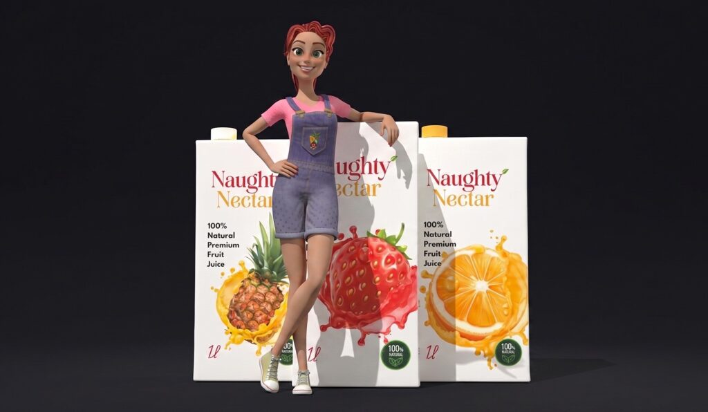
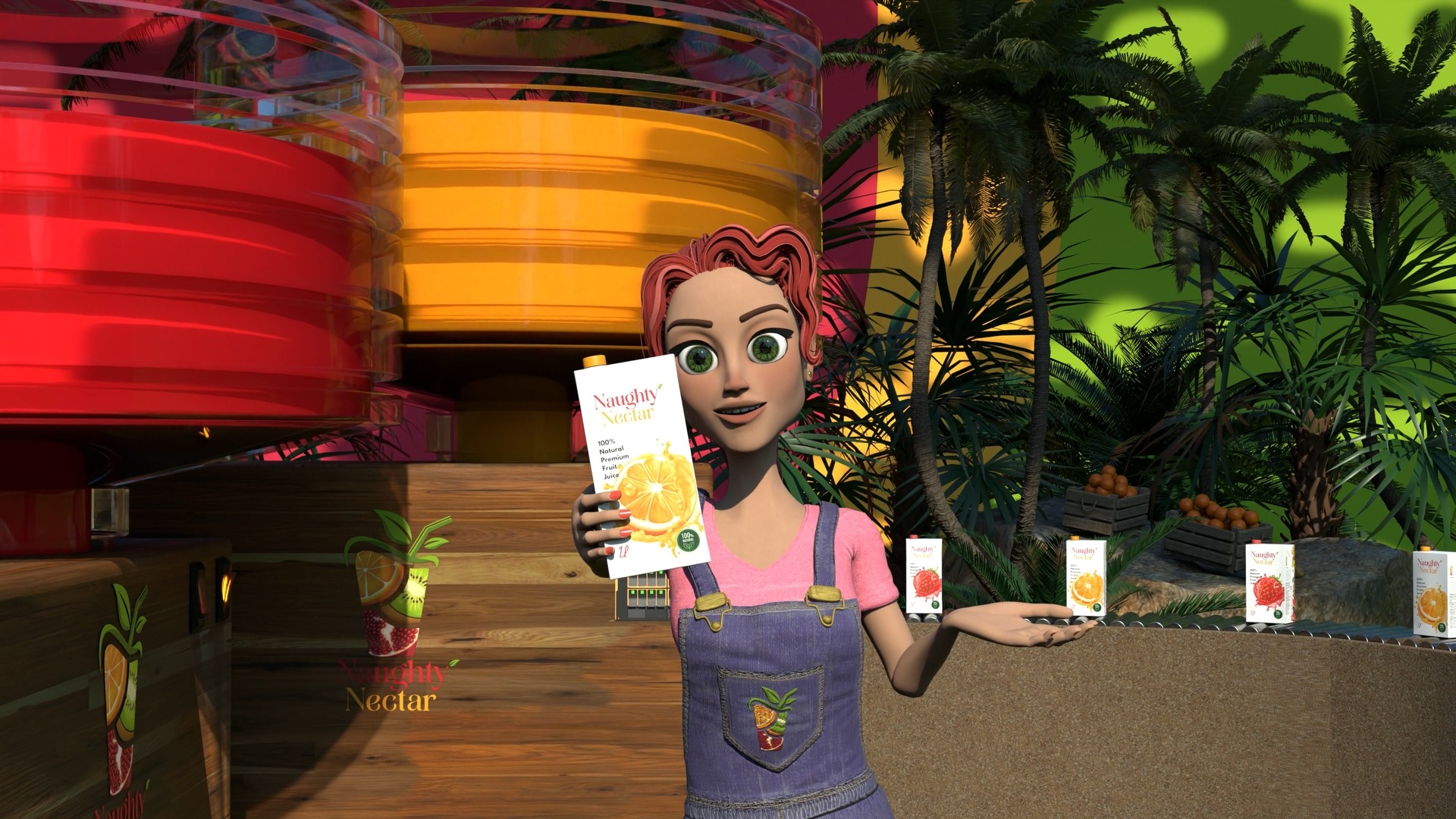
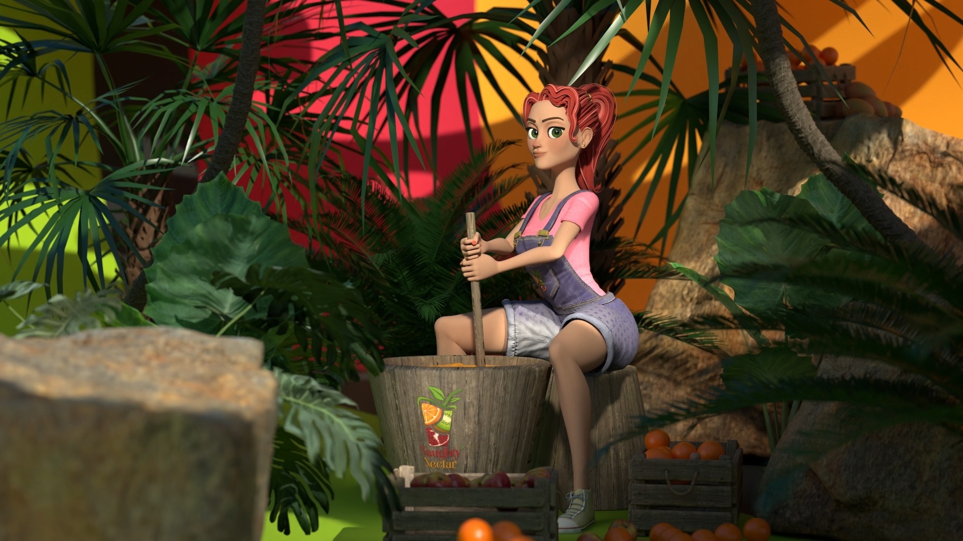
A real example: building the whole world
The clearest way to explain what this looks like in practice is to show it rather than describe it. When Naughty Nectar — a fresh juice brand with a bold, fruit-forward personality — came through the door, the brief wasn't "make us some ads." It was a more honest problem: they had a clear personality and no visual language to match it. The task was to build the whole world, from scratch, in a way that every future ad they'd ever run would draw from the same visual DNA.
From zero visual identity to a full motion campaign — every touchpoint built to be coherent
The project covered brand discovery and moodboarding, logo development across multiple colourways, a full colour and typography system, and a motion ad campaign designed specifically for social media — short cuts engineered to hold attention as standalone clips or as part of a longer sequence. The quote that drove the brief: "Every touchpoint — from the logo to the final frame of the ad — needed to feel like the same brand. That coherence is what turns a viewer into a customer."
The point isn't to catalogue the deliverables. The point is what they represent: a brand that can now run any ad, on any platform, in any format — and every single time, it will look like Naughty Nectar. Not like a template with a logo dropped in. Not like a generic animation with the right fonts. Like a world with its own visual logic, built to be recognised and remembered.
That's the asset. Not the individual ad. Not the individual logo file. The entire coherent system that makes every future creative decision faster, cheaper, and more effective — because the hard work has already been done.
The question worth asking
Before the next campaign. Before the next Canva session. Before the next conversation with a media buyer about why the targeting needs adjusting — ask the question nobody asks first: does my brand have what it takes to make a good ad?
Does it have a visual identity that was built to work in motion? Do your ads look like your website? Does your brand have a personality that comes through consistently in every frame, or does it look different every time it shows up? If the answer to any of those is no — or even maybe — that's where to start. Everything else is just spending money into a problem that a bigger budget won't fix.
Get in touch with us

Kael Mercer
Free Resource
The 3D Character Brief Checklist — every field your studio or freelancer needs before modelling starts. One page, free PDF.
Ready to start your project?
hambapixel.com · Studio & freelance 3D
You’re paying for attention you’re not keeping. 105 Views South Africa has one of the highest small business failure rates on the …
Your ads aren’t broken. Your brand is. 110 Views Every week, somewhere on the internet, a business owner posts the same question …
3D Animation for Small Businesses Stop Losing Customers to the Scroll 1692 Views Your potential customer scrolls through 90 metres of content …
How to Brief a 3D Character Artist 824 Views Let’s be honest. Most creative briefs are terrible. Not because clients are bad …